Giesecke+Devrient
A new benchmark for premium payments
Courting high net-worth wealth banking clients has been a constant challenge for financial institutions the world over. Our long-term client, G+D, had developed a compelling new payment product for banks looking to elevate their prestige banking tiers—but they needed the right proposition, visuals, and messaging to position it for their market of global clients. That’s where we came in.
Where we started
For years, metal cards defined the premium end of the payments market. But as they became increasingly mainstream—driven by rising consumer demand and a growing number of issuers entering the space—there was an opportunity to create something even more exclusive.
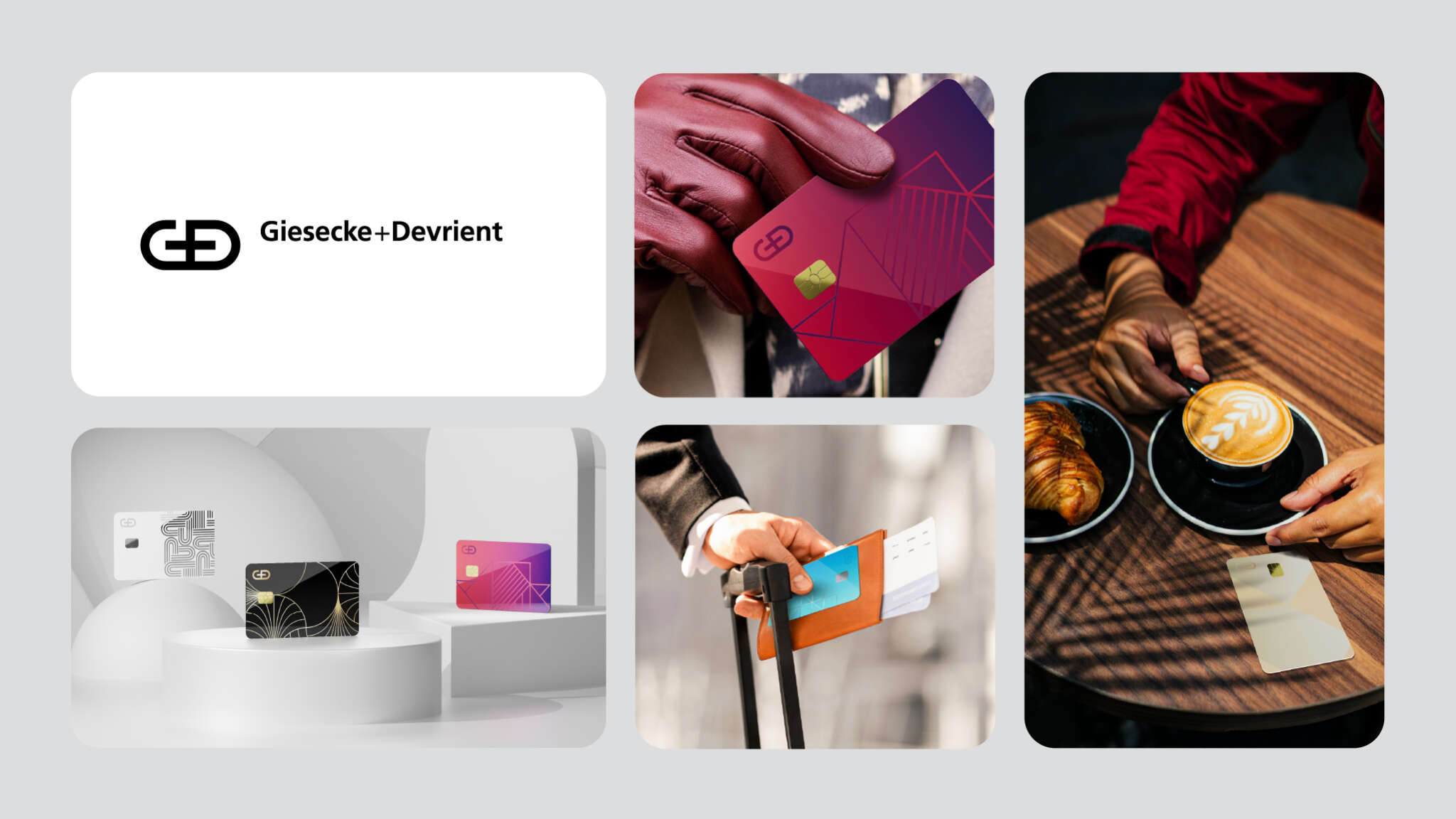
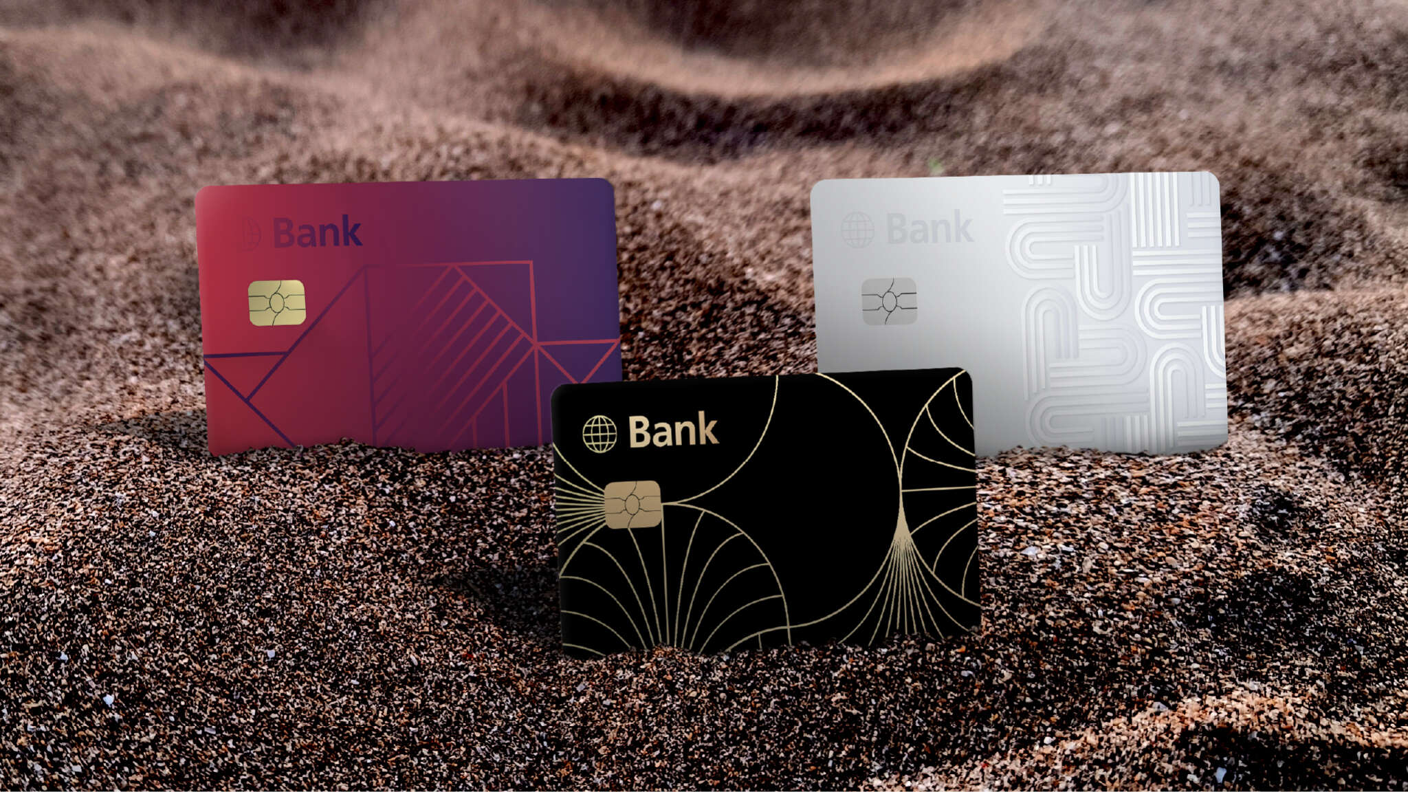
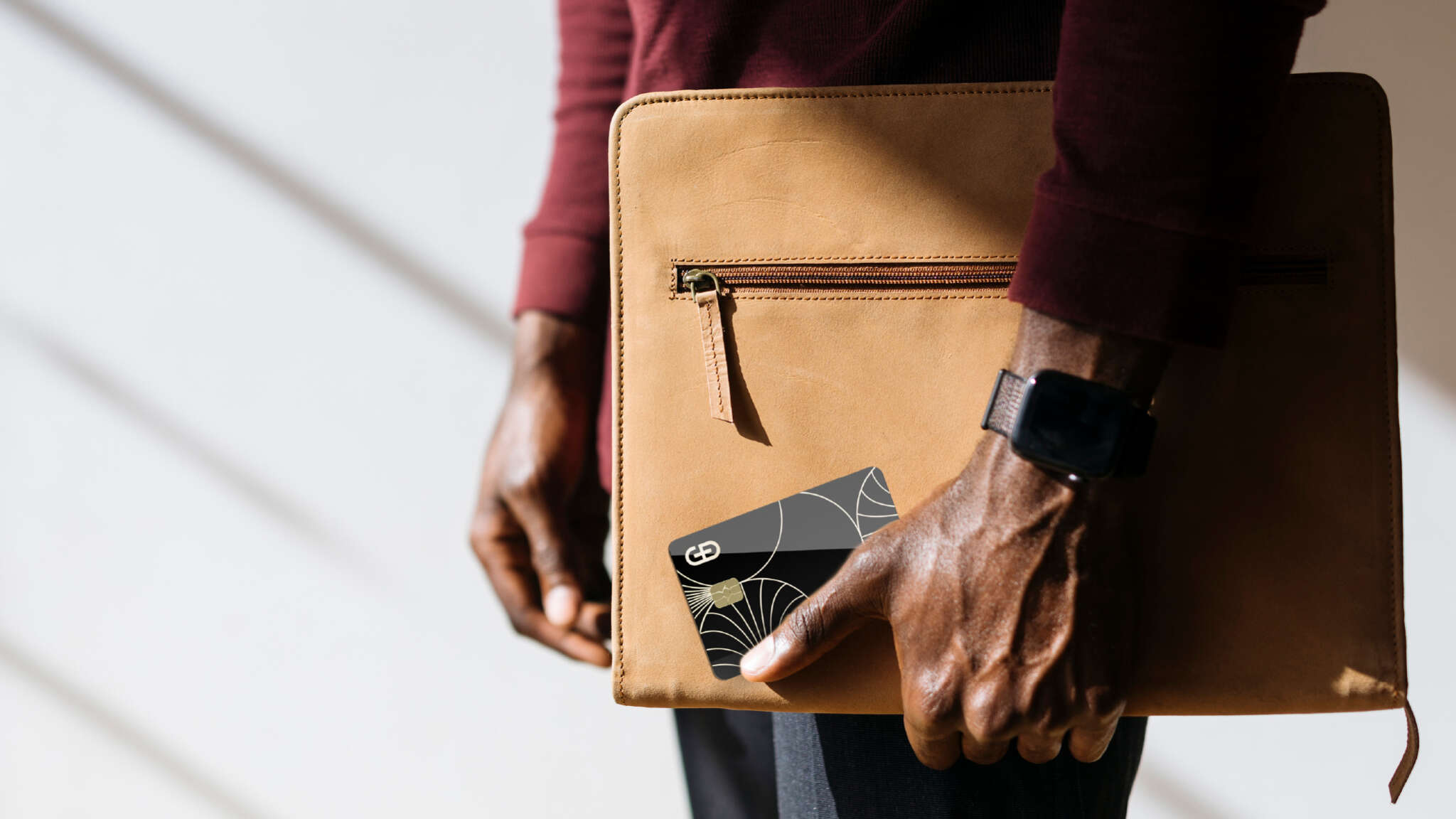
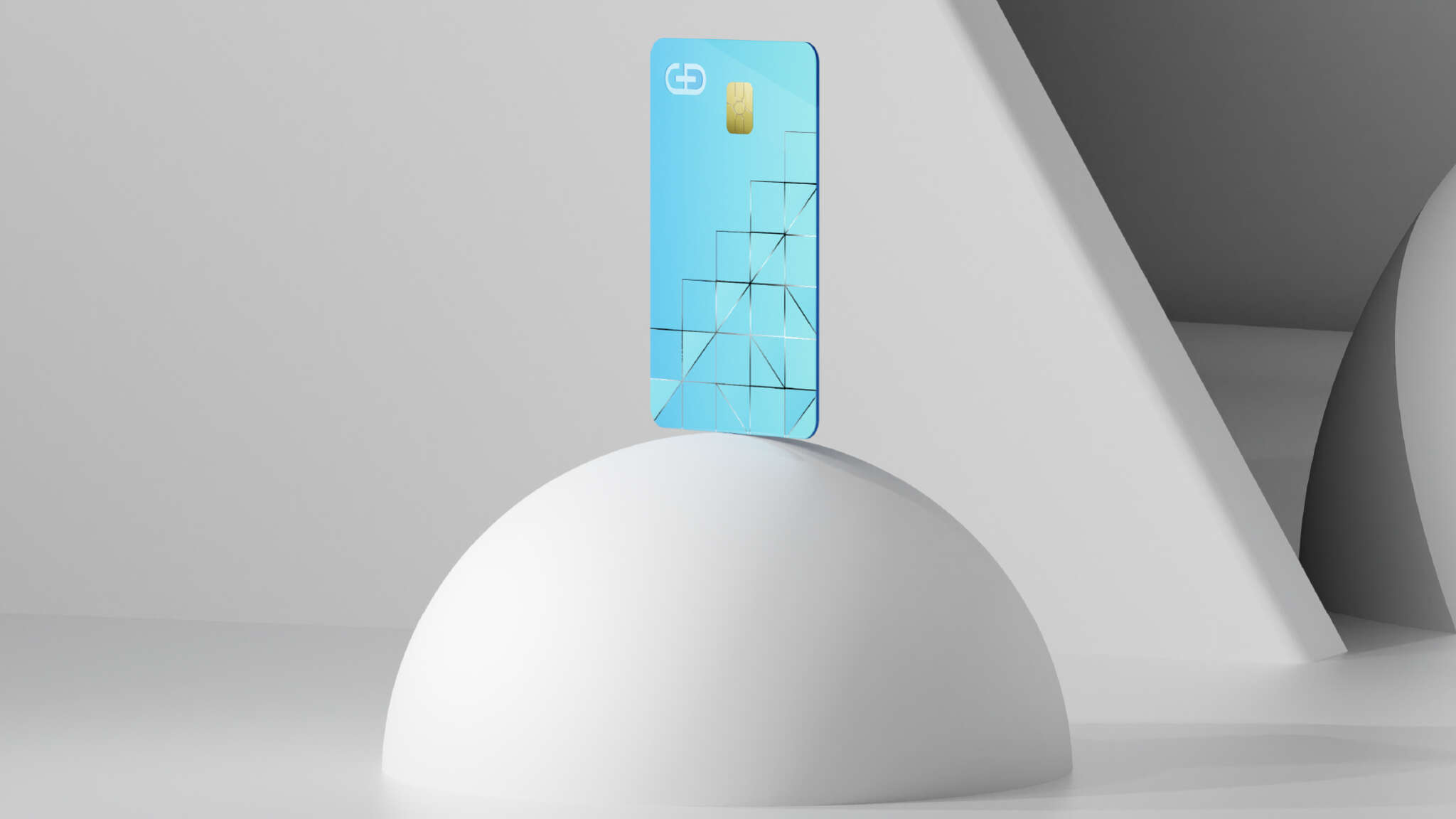
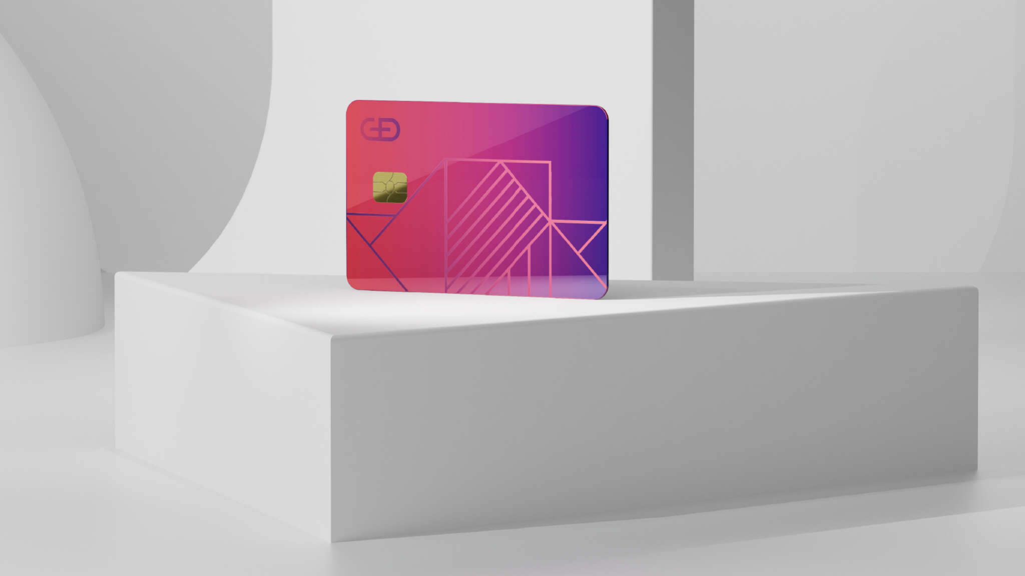
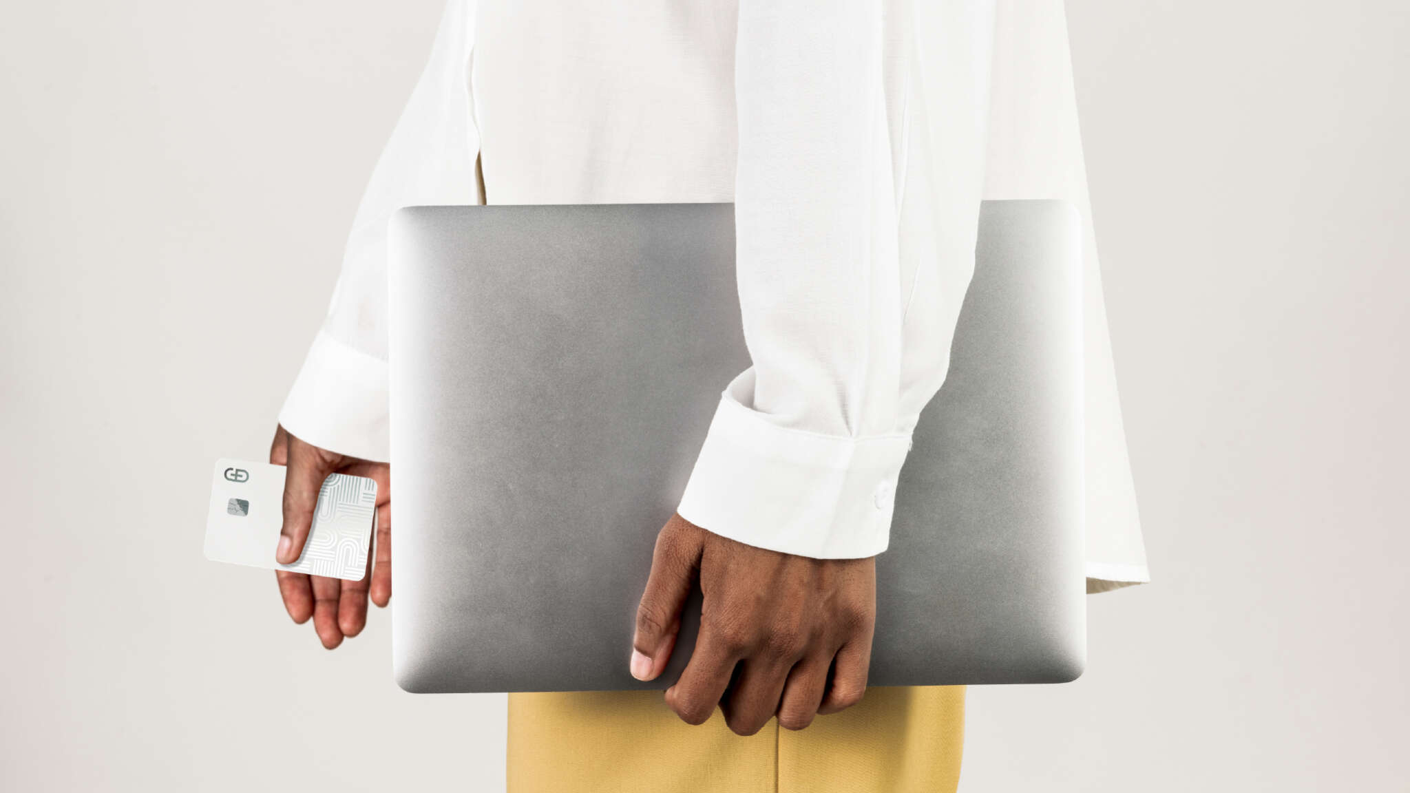
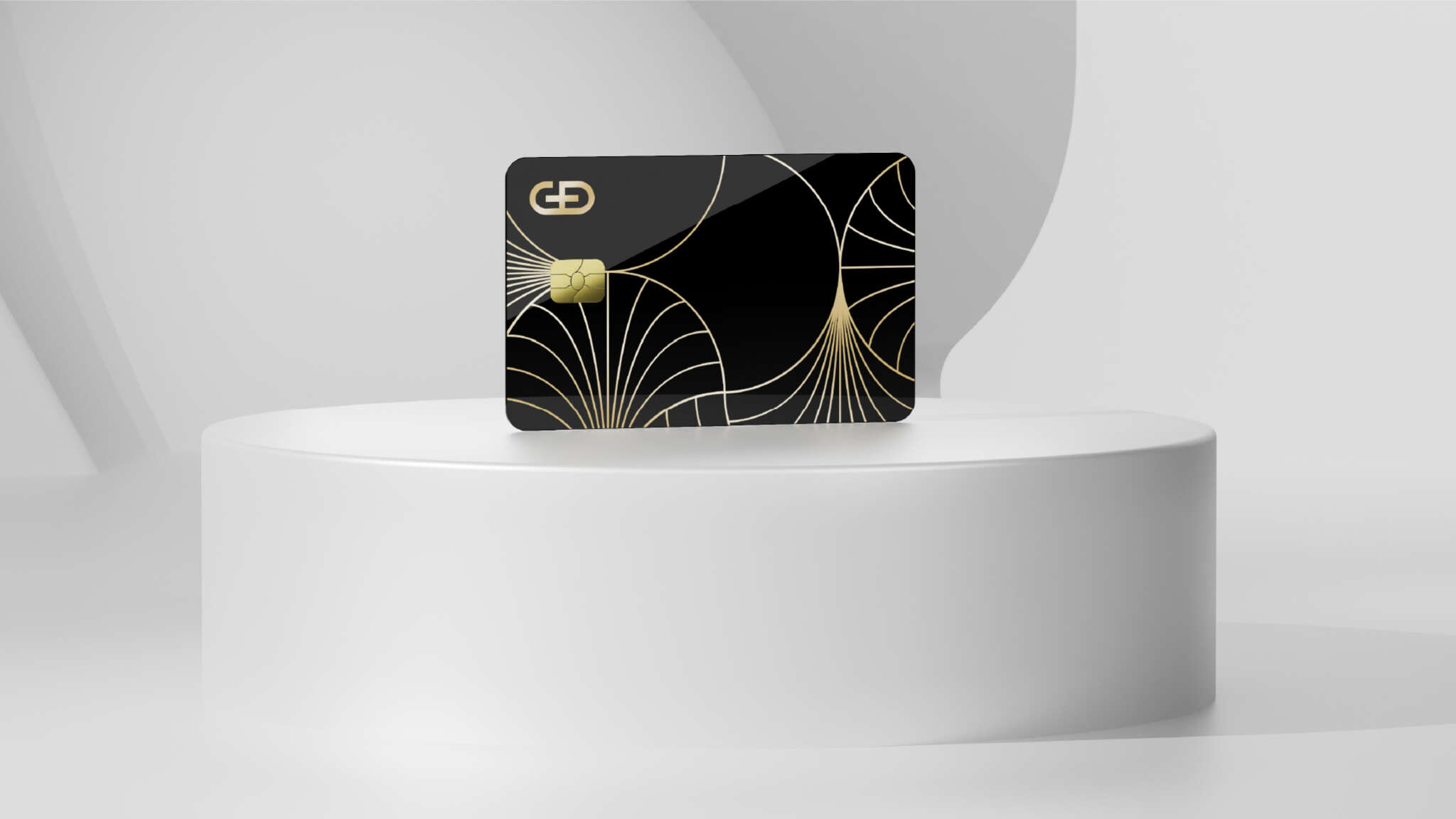
G+D created Convego® Ceramic: a payment card body made from 100% ceramic, designed to sit above metal cards in both prestige and perceived value. And, to bring it to market in the strongest way possible, they approached us to help develop the proposition, visual language, and storytelling needed to position the ceramic card as the next evolution in luxury payment experiences.
The challenge
The challenge was not simply to launch a new card material, but to evangelise and create desire around an entirely new category within premium banking.
While the product itself was highly innovative, its value needed to be communicated through perception, aspiration, and storytelling. The ceramic card needed to be seen as a luxury object that would be worth the investment from banks—something associated with exclusivity, status, and an elevated customer experience.
How we did it
Our approach centred on positioning the ceramic card as more than a payment product. Rather than focusing purely on technical innovation or manufacturing credentials, we built the proposition around exclusivity, craftsmanship, and lifestyle appeal—framing the ceramic card as the crown jewel of premium banking experiences.
To support this positioning, we developed a complete visual and messaging expression for the product. This included defining the product proposition, shaping the overall look and feel, and creating a suite of card concepts to showcase the aesthetic design potential of Convego® Ceramic. The negative spaces from the G+D brand symbol were used to create geometric shapes for the card faces and for the visual world the cards were presented in; a subtle touch to help with brand tie-in.
Alongside the strategic and creative work, we produced a broad range of campaign and sales assets, including a dedicated product page, sales presentation, brochure, data sheet, social campaign assets, and a cinematic motion piece designed to elevate the tactile and visual qualities of the card.


Outcome
The work helped to establish a stronger market perception around the ceramic card category—moving the conversation beyond functionality and towards desirability. With a consistent suite of sales and marketing assets in place, the client has been able to engage prospective partners and globally, leading to strong commercial results.
WE LIKE TO TALK
If you’d like to learn more about how we can help you define your business identity, have a chat with us today.